Quick answer — Do not crop. A 1080x1080 master cropped to a 728x90 leaderboard loses the subject and the text. Re-rendering regenerates the creative at the target ratio with the elements recomposed, which is what Image Adapts in Vitra.ai Universe does per size.
Image personalization handles the per-size adaptation.
Why cropping fails
A square master has your product centred and your headline underneath. Crop it to a 728x90 leaderboard and you get a horizontal slice of the product with no headline at all. Crop it to a 300x600 skyscraper and you get the headline with the product cut in half.
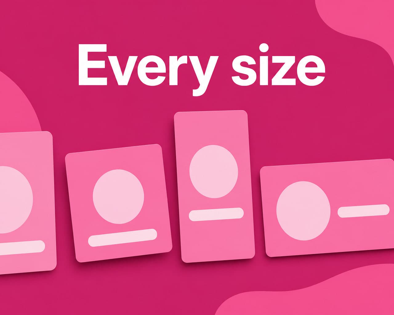
Every aspect ratio is a different composition problem. Cropping pretends it is one.
Re-rendering instead
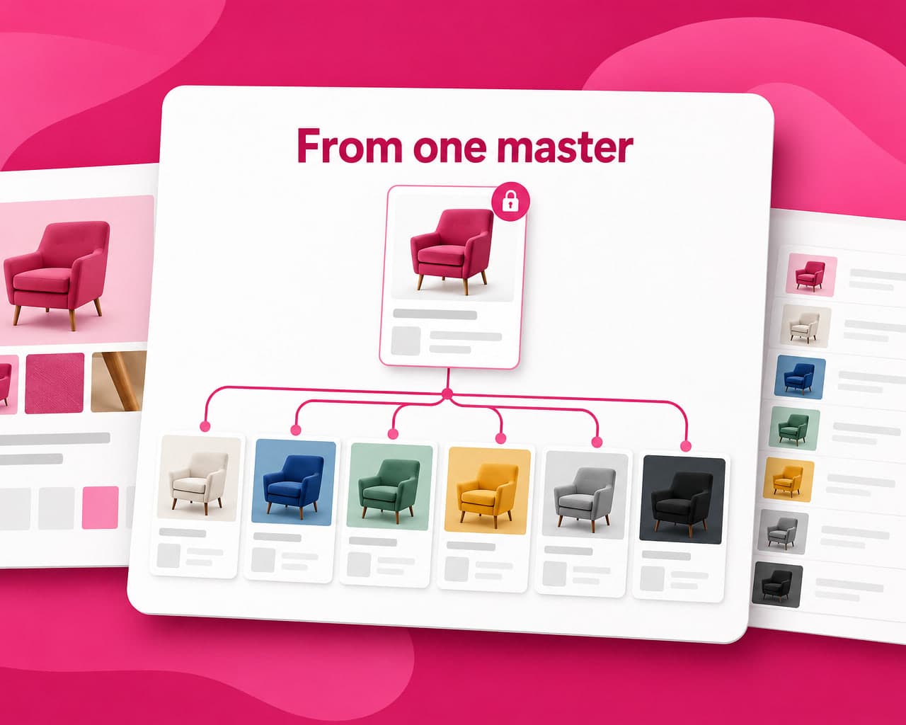
Adapts takes the master and regenerates it at each target dimension, recomposing rather than slicing — the subject repositions, the layout reflows, the text finds somewhere sensible to sit. You supply one creative and a list of sizes, and each one comes back as its own render.
The dimension list is explicit rather than a ratio guess, which matters because ad platforms specify pixels, not ratios.
The sizes worth having
| Group | Sizes |
|---|---|
| Google Ads, high performance | 300x250 medium rectangle, 728x90 leaderboard, 160x600 wide skyscraper, 320x50 mobile leaderboard |
| Google Ads, high impact | 300x600 half page, 336x280 large rectangle, 970x250 billboard, 320x100 large mobile banner, 1200x628 landscape responsive |
| Meta | 1080x1080 square, 1080x1920 story, 1200x628 landscape |
| 1200x627 post, 1080x1920 story | |
| 1080x1920 status, 500x500 profile | |
| 1080x1350 portrait post, 1080x1920 story |
The two mobile banner sizes deserve attention. 320x50 and 320x100 carry a large share of mobile display inventory and they are the hardest to design for, because there is almost no vertical room. They are also the two most often skipped, which is why so much mobile display looks like a squashed desktop banner.
What to check on the output
Re-rendering is generative, so it needs a review pass rather than blind trust:
- The logo. Position and proportion should hold. Verify it did.
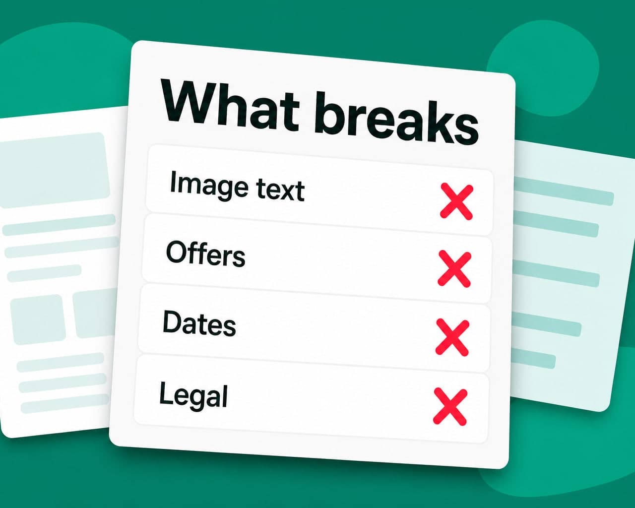
- Legal text. Minimum sizes are a legal minimum, not a design preference.
- The product. Colour and shape must match the master exactly.
- Text that was baked into the image. It gets re-rendered too, which is usually good and occasionally not.
Running the set through quality control before trafficking catches the ones that drifted.
Where this fits with localization
The same mechanism handles the other axis. One master, every size, and every language — because the text in the creative is a layer that can be swapped rather than pixels that have to be redrawn by a designer.
That combination is where the volume comes from. Nine sizes and six languages is 54 assets from one approved master.
Where to start
Take your best-performing square creative and generate the five Google Ads sizes from it. Compare against whatever your team cropped last quarter. The mobile banners will make the case on their own.
When the words change too
Resizing is only half a market launch. If the creative carries text inside the image, that has to be re-set per language as well — see AI image translator for what each file format allows.
FAQ
Why not just crop an ad creative to different sizes? Because each aspect ratio is a different composition problem. A square master cropped to a 728x90 leaderboard loses the headline entirely, and cropped to a 300x600 skyscraper cuts the product in half.
What are the most important ad banner sizes? For Google Ads: 300x250, 728x90, 160x600, 320x50 and 320x100. Then 1080x1080 and 1080x1920 for Meta and Instagram, 1200x627 for LinkedIn. The two mobile banners are the ones most often skipped.
What should be checked on an AI-resized creative? Logo position and proportion, legal text against its minimum size, product colour and shape against the master, and any text that was baked into the image, since that gets re-rendered too.
Can one creative be adapted for size and language at once? Yes, and that is where the volume comes from. Text in the creative is a layer that swaps rather than pixels a designer redraws, so nine sizes across six languages is 54 assets from one master.