Quick answer — Infotainment strings face fixed screen widths, a reader who cannot look for long, and a text-to-speech layer that has to sound right. Length budgets and glance-readability matter more than elegance, and prompts need reviewing by ear.
Vitra.ai Universe keeps one vehicle vocabulary across manual, showroom and screen.
The reader is driving
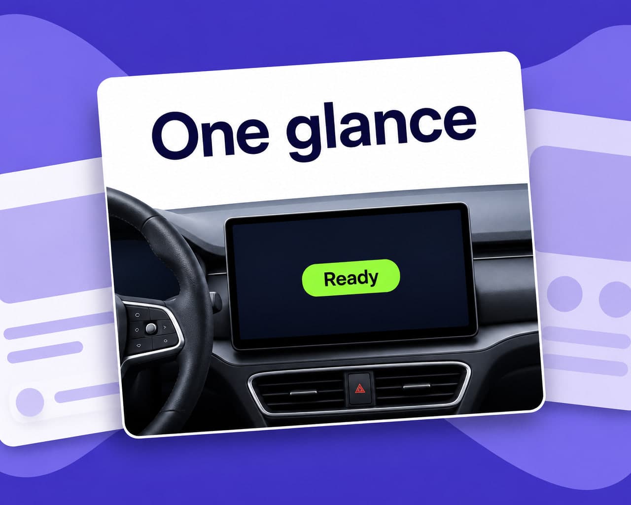
Every other interface can assume an attentive reader. This one cannot. An in-car string has to be understood in a glance, which rewards short concrete wording and punishes the subordinate clauses that a careful translation naturally produces. A longer, more precise rendering is the worse one here.
Length is a hard constraint
Automotive HMI layouts are fixed far earlier than app layouts and cannot reflow freely, so expansion has nowhere to go.
| Surface | Typical limit |
|---|---|
| Menu label | Very short, fixed field |
| Status line | Fixed width, no wrap |
| Warning message | Fixed area, high consequence |
| Voice prompt | Time rather than characters |
| Cluster display | Smallest area, oldest hardware |
Setting a per-string character budget at design time and translating to it is the only approach that scales. Discovering truncation during vehicle testing means a software change to a build that is already in validation, which is expensive in a way an app hotfix is not.
The spoken layer
Most of these strings are also read aloud, and text that works on screen does not automatically work in speech.
Abbreviations, units and numbers all need a spoken form decided explicitly, and prompt register has to be checked by ear rather than on the page — the same problem set out in voice assistant localization. Prompts read during driving should be short enough to finish before the manoeuvre they describe.
Safety and legal text
Some on-screen text exists because a market requires it, including acknowledgement screens and driver-attention messages.
That wording is not the content team's to optimise. It comes from the compliance function, and the pipeline's job is to deliver it unchanged and traceably into every build. Flagging those strings so they route for approval rather than translation is worth doing once, in the string file itself.
Running it
Mobile app translation handles the resource bundles, with the glossary pinned so a control named on screen matches the owner manual and the physical switch.
Agentic workflows hold compliance-flagged strings for approval while the rest continues, and quality control runs on the rendered screen rather than the string list, because truncation is invisible until the text is laid out. In-vehicle strings are product strings, which is software localization.
FAQ
Why are infotainment strings harder than app strings? The reader is driving, so the text has to be understood in a glance, and the layouts are fixed early and cannot reflow. Expansion has nowhere to go, and a more precise longer rendering is the worse one.
How do you stop truncation in a vehicle HMI? By setting a character budget per string at design time and translating to it. Finding truncation during vehicle testing means changing software already in validation, which is far costlier than an app fix.
What about spoken prompts? They need a decided spoken form for abbreviations, units and numbers, and review by ear rather than on the page. Prompts read while driving should finish before the manoeuvre they describe.
Who owns legally required on-screen text? The compliance function. Those strings should be flagged in the string file so they route for approval and reach every build unchanged rather than being optimised by the content team.